Paradise Palm Soda
Student work- Passion Project
Spring 2020
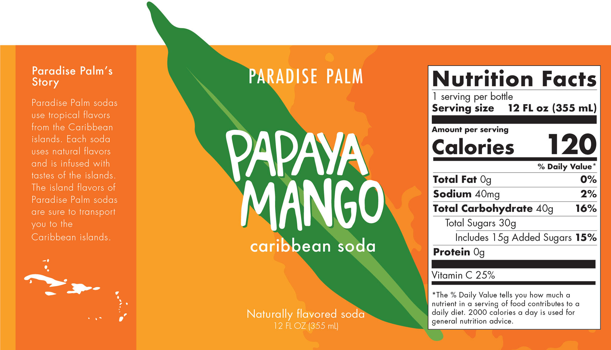
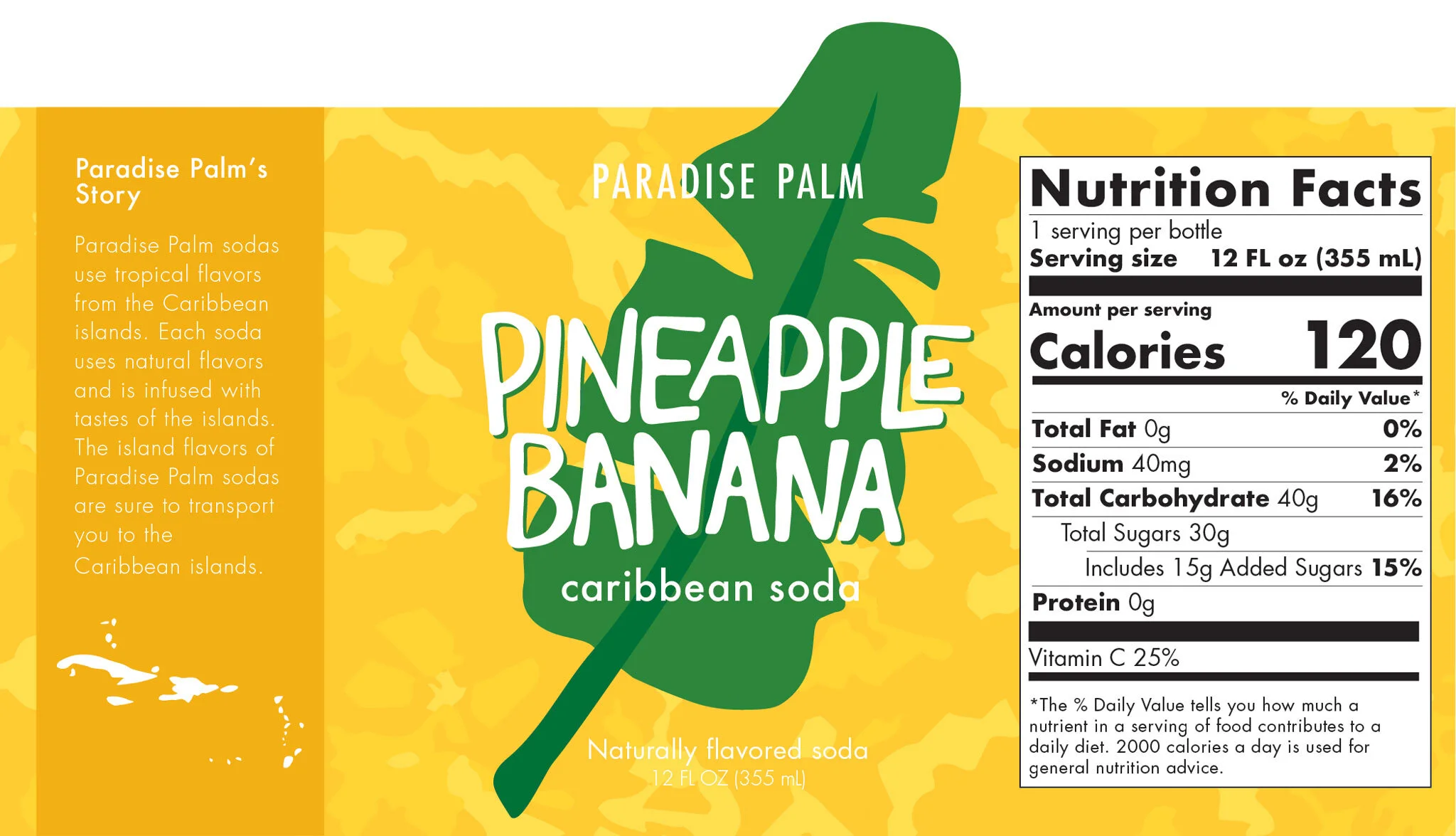
This passion project is packaging of a Caribbean soda. The soda, Paradise Palm, is Caribbean inspired but, for markets in America. This project is meant to be fun and lively. The illustration and lettering is very loose to keep a playful feeling. The packaging uses elements of Caribbean fruit, including texture and leaves.
Textures
The backgrounds of the Paradise Palm panels come from one of the fruits featured in the bottle. The texture on the far left is a mango, the one in the middle is a coconut, and on the far right is a pineapple. Though these are abstract shapes and not easily identifiable, the goal was to create depth on the label.
Illustrations
The leaf illustrations also come from one of the fruits featured on the label. On the left is a mango leaf, the middle is a coconut leaf, and the right is a banana leaf. The leafs are illustrated in a loose, flat texture to keep the same feeling as the rest of the elements of the packaging and to be playful.


